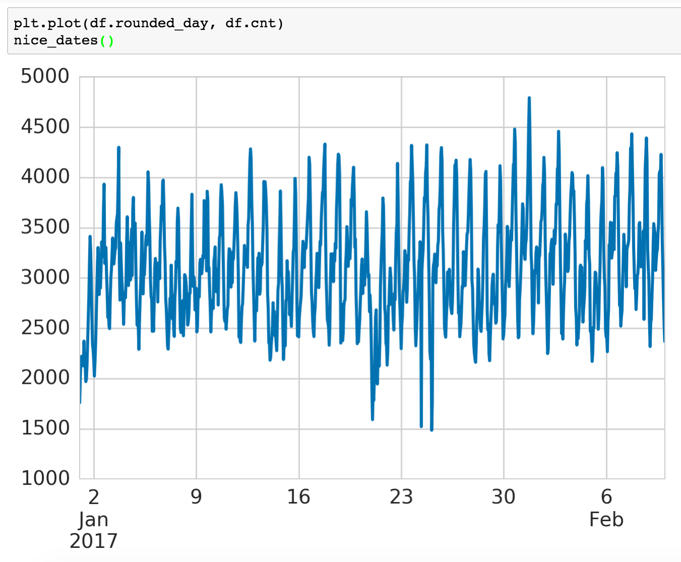
Timeseries graphs are commonplace, but there doesn’t seem to be a sane way to plot date axes in Matplotlib (and I’m not the only one who thinks so). This is what the default plot produces:

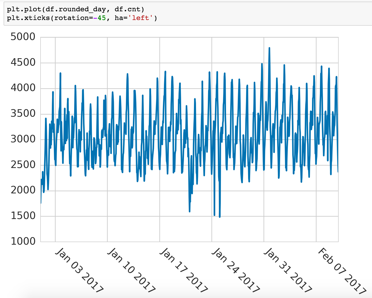
One solution is to rotate the labels, but reading the slanted wording isn’t easy, and it’s not immediately clear where the labels line up.
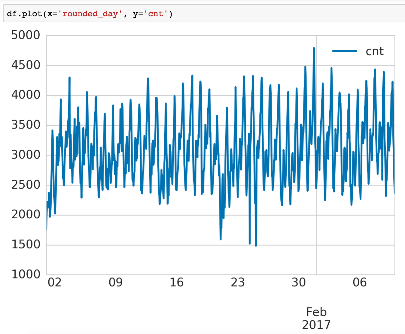
Pandas’ solution is slightly better. Organizing the various time periods (eg. days, months, years) into layers helps readability and makes it each label shorter so no rotation is needed. However, it is inconvenient to have to convert data into Pandas dataframes just to use the plotting functionality. One other shortcoming is that the reader has to work hard to deduce the month of the first few ticks.
We now have a sense of what a good solution should look like:
- One easy-to-remember function that automatically infers and plots axes.
- Ticks shouldn’t be too sparse or dense: 1-2 ticks per inch seems around right.
- Labels should be readable. No overlapping or rotating.
- Labels should organize times based on the hierarchy of time periods.
- This minimizes repetition, like specifying the year in each label when the entire time period lies within the same year.
- Helps readers parse information more quickly.
- The first label should set the context for the time period, perhaps specifying two levels upward of the underlying frequency of the graph.
Solution
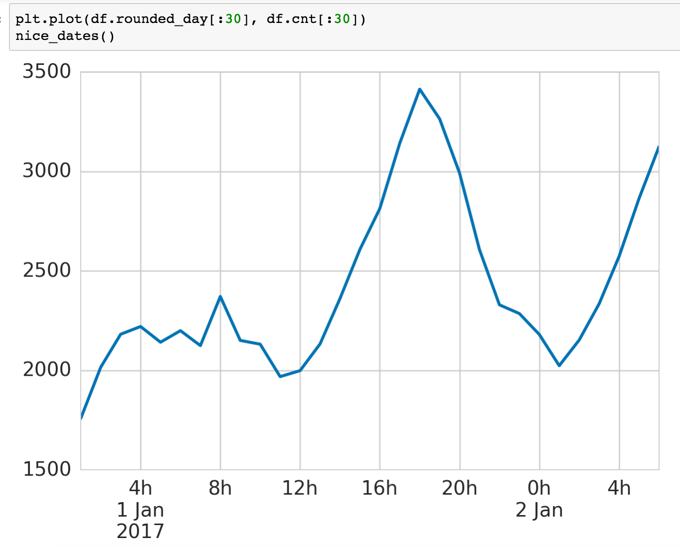
I implemented nice_dates() which infers the density and type of ticks to display based on the width of the plot. It organizes the labels based on the hierarchy of time periods while always contextualizing the first data point with two extra levels of time periods. It supports time intervals from 1 second to 10 years, but can be easily extended.